Quick Review: CSS Positioning

For web designers and developers, it is important to understand how to lay elements out on a page. Anybody can hack together a gorgeous looking webpage, but it’s important to write clean code along with it. It’s amazing how a basic understanding of HTML and CSS can make web projects more clean and maintainable. This is a little primer on the basics of CSS positioning.
Moving with the Flow
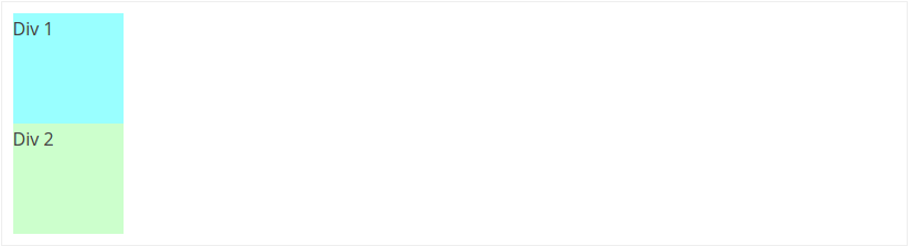
Before we get right to positioning, we have to understand how browsers display content. Normal flow is the way a browser renders un-styled (no CSS) elements on the page. It starts from the top of the viewport and works its way to the bottom. Each element is displayed in the order it appears in the HTML. Elements can have one of two basic display properties: block and inline.
A block element will have a line break above and below it. Simply put, it will always display on its own line. For example, div elements are block by default. So, they will appear on the page stacked below each other:
An inline element will display on the same line as other inline elements on the page. If they reach the end of the viewport, the elements will continue on the next line. For example, span elements are inline by default and will appear side-by-side “in line” with each other:

Using only normal flow, it’s possible to build very simple layouts. To construct more creative designs, we need more control over the positions of the elements on the page. This is where CSS and the position property come in handy!
Position: Static
By default, positions for all elements on the page are static. So, it is unnecessary to specify this. An element can be set to static if its current position needs to be overridden. Any statically positioned elements will conform to the normal flow.
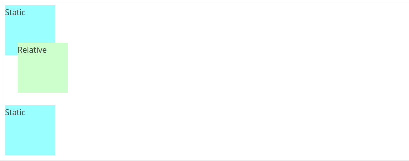
Position: Relative
Relative positioned elements conform to the normal flow of the page, but we are able to move them around using the top, right, bottom, and left properties. Although the elements move according to our specifications, the space they originally inhabit will continue to be respected by any surrounding elements.
div {
  height: 100px;
  width: 100px;
}

.static {
  background-color: #99FFFF;
}

.relative {
  background-color: #CCFFCC;
  position: relative;
  left: 25px; /* 25px from left of normal position */
  bottom: 25px; /* 25px from bottom of normal position */
}
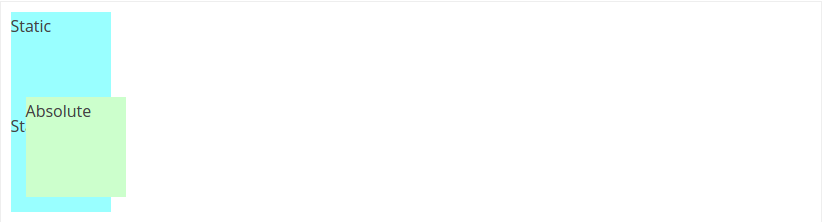
Position: Absolute
Absolute positioned elements also use the top, right, bottom, and left properties for specific placement on the page. These elements are completely taken out of the normal flow. Instead of moving the object from its original position, we are moving it relative to the viewport.
div {
  height: 100px;
  width: 100px;
}

.static {
  background-color: #99FFFF;
}

.absolute {
  background-color: #CCFFCC;
  position: absolute;
  left: 25px; /* 25px from left of the viewport */
  bottom: 25px; /* 25px from bottom of the viewport */
}
Note: Assume the border around the example is the viewport.
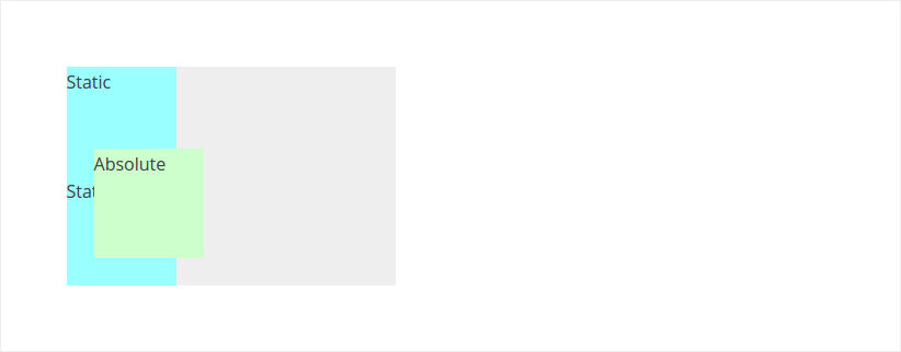
Position Context
What if we want to adjust an absolute positioned element with respect to a container rather than the viewport? This is known as changing the position context of an element. We do this by giving the parent a position value other than static.
div {
  height: 100px;
  width: 100px;
}

/* the parent of our elements */
.container {
width: 300px;
  background-color: #EEEEEE;
  position: relative; /* position != static */
  margin: 50px;
}

.static {
  background-color: #99FFFF;
}

.absolute {
  background-color: #CCFFCC;
  position: absolute;
  left: 25px; /* 25px from left of parent container */
  bottom: 25px; /* 25px from bottom of parent container */
}
Position: Fixed
Fixed and absolute elements are very similar. Both are positioned with respect to the viewport. However, the position context can never be changed for fixed elements. Also, the distinct feature of fixed elements is that they are stuck in their position, even when the page is scrolled. For an example, check out this jsFiddle.
Summary
Here is a quick list of “things to remember” when working with CSS positioning:
Static
- the default position for all elements
- conform to the normal flow of the page
Relative
- all surrounding elements respect its original normal flow
- can be moved using
top,right,bottom, andleft
Absolute
- completely taken out of the normal flow of the page
- can be moved using
top,right,bottom, andleft - the position context can be changed by giving the parent container a non-static position
Fixed
- completely taken out of the normal flow of the page
- can be moved using
top,right,bottom, andleft - will stay fixed with the viewport, even on scroll